Introduction
Your website is the first thing a potential client sees before they ever pick up the phone. For attorneys, doctors, consultants, and other service-based professionals, that first impression determines whether someone books a call or clicks over to a competitor.
The stakes are real. According to Clutch's 2025 research, 83% of consumers judge a website's credibility in under 20 seconds — and nearly 90% make an inquiry or booking directly through a company's website. Meanwhile, 17% of small businesses still have no website at all.
That gap is expensive. This guide walks through the essential pages, design practices that convert visitors into clients, and how to decide whether to build your site yourself or bring in a professional.
Key Takeaways
- A website you own beats social media you rent — algorithm changes can erase your reach overnight
- Five pages are non-negotiable before launch: Home, About, Services, Contact, and a 404 page
- Strong photography and a clear headline above the fold do more than any design trick
- Specific, outcome-focused copy always outperforms clever or vague messaging
- A lead-generation website moves visitors toward action — a brochure website just sits there
Why Your Small Business Website Is Your Most Valuable Marketing Asset
Social media platforms can limit your reach with a single algorithm update. Your website cannot be taken from you. It is the one digital asset you control — which makes it the foundation of every other marketing effort you run.
Verisign's consumer survey found that 84% of consumers believe a business with a website is more credible than one with only a social media presence, and 77% say a website directly increases trust. For service-based businesses — where a client is deciding whether to hand you their legal case, their health, or their finances — that credibility gap is the difference between a signed engagement and a missed opportunity.
That trust has to be earned before a single conversation happens. For service businesses, the website carries three distinct jobs:
- Build trust before a prospect ever speaks to you
- Communicate expertise clearly enough that the right clients self-qualify
- Drive inquiries through visible, specific calls to action
A site that fails at any one of these costs you real revenue. Every week a prospect visits your homepage, finds nothing that speaks to their specific problem, and leaves without contacting you is a week that site worked against you.
Essential Pages Every Small Business Website Needs
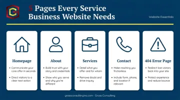
The U.S. Small Business Administration identifies five essential pages for any small business website. For service-based businesses, these five form the foundation:
| Page | What It Must Accomplish |
|---|---|
| Homepage | Immediately communicate who you help, what you do, and what to do next |
| About | Build personal trust — credentials, story, and the human behind the business |
| Services | Describe each service with enough detail to answer pre-inquiry questions |
| Contact | Make reaching you frictionless — phone, email, and a form above the fold |
| 404 Error Page | Keep lost visitors on your site with a helpful redirect |
That covers the baseline. For law firms, healthcare practices, and consultants, two additional pages make a real difference:
- Testimonials or Case Studies — These address specific trust barriers clients have before hiring a professional. A prospect deciding between two attorneys will spend meaningful time on this page.
- FAQ — Answers common pre-appointment questions and reduces the friction of the first inquiry.
A five-page site with clear, specific copy will outperform a fifteen-page site with vague, generic messaging every time. Page count is not the goal. Clarity is.
Small Business Website Design Best Practices
Start with Photography
Before you choose a template, a color palette, or a font — get your photography right. Nielsen Norman Group's research is clear on this: users pay close attention to photos of real people actually associated with the organization, and they ignore generic stock imagery.
For service businesses, this means:
- Professional headshots of you and your team
- Photos of your workspace, office, or environment
- Images of completed work or client interactions (where appropriate)
- Zero stock photos of anonymous people shaking hands
Visual appeal is assessed within 50 milliseconds — before a visitor reads a single word. Your photography either builds trust in that half-second or it doesn't.
Use a Template as Your Starting Point
Templates solve structural problems upfront. A quality template manages spacing, hierarchy, section order, and mobile responsiveness — freeing you to focus on branding, copy, and photography. For service businesses that need to appear polished and authoritative, this matters.
Blank-canvas builds invite experimental choices that quietly undermine credibility. Start with structure, then make it yours:
- Use a template built for service businesses, not portfolios or e-commerce
- Customize colors, fonts, and imagery — don't redesign the layout
- Test on mobile before launching (over 60% of web traffic is mobile)
Visuals and Branding
Keep your visual system simple and consistent:
- Fonts: One for headings, one for subheadings, one for body copy — no more
- Color palette: Pull directly from your photography for instant cohesion
- White space: Increase padding between sections and margins around text blocks
That last point matters more than most owners realize. Visitors don't leave sites because there's too much content. They leave because the content feels claustrophobic. A few extra pixels of breathing room can transform a dense page into one that reads cleanly.
Content and Messaging
The most common small business website mistake is launching with too little content on the homepage. A well-structured homepage should walk visitors through:
- What you do and who you help
- How it works
- Social proof (testimonials, credentials, results)
- A clear call to action
Use this five-question test: after reading your homepage, an unfamiliar visitor should be able to answer:
- Who do you help?
- What do you do?
- How does it work?
- What does it cost (or how do I find out)?
- Why you over a competitor?
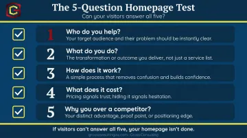
If they can't answer all five, your homepage isn't done.
If a visitor has to work to understand what you offer, they'll leave. Service clients are searching for solutions to specific problems. Write headlines and service descriptions in the plain language your ideal client actually uses — not industry jargon, not clever wordplay.
Best Small Business Website Examples and What They Get Right
Law Firms and Consulting Firms
Strong professional service websites share a consistent structure. Above the fold, visitors should find:
- A headline naming the specific client and their problem ("We help Colorado entrepreneurs resolve business disputes quickly and affordably")
- Professional photography (not stock imagery)
- A primary CTA — typically "Schedule a Free Consultation"
- Credentials, bar memberships, or notable client outcomes visible without scrolling
What they avoid: vague positioning language like "Dedicated to Excellence" that could describe any firm in any industry.
Healthcare and Wellness Practices
The best healthcare practice websites earn trust before a patient ever books an appointment. They typically include:
- A real photo of the practitioner (not a stock stethoscope)
- Service pages with enough clinical detail to answer pre-appointment questions
- Booking functionality one click away from any page
eCommerce and Product-Based Small Businesses
High-performing product-based sites are built around frictionless navigation. The best ones share:
- A hero section with a prominent CTA ("Shop Now" or "See the Collection")
- Organized product categories that let visitors self-navigate
- Fast page loads that don't lose buyers mid-browse
- Product pages with enough imagery and description to drive purchase decisions without a sales call
The Common Thread
Across all three categories, the pattern is the same: none of these sites make the visitor work to figure out what to do next. Every page has a clear, logical next step: read more, book a call, or make a purchase.
What failing sites share:
- Generic stock photography
- Vague headlines that could belong to any business in any industry
- No visible contact information above the fold
- A homepage that reads like a mission statement instead of a client-focused offer
Designing Your Website to Generate Leads, Not Just Traffic
A brochure website displays information. A lead-generation website moves visitors toward a specific action. For service businesses, the goal is always the latter.
Build CTAs That Actually Convert
Specific, action-oriented language tied to a clear outcome performs better than generic prompts. Compare:
- ❌ "Contact Us"
- ✅ "Book a Free Strategy Call"
CTAs should appear above the fold on your homepage and repeat at logical decision points throughout the site — particularly at the bottom of every services page, where a prospect has just read your most compelling case for hiring you.
Capture the Visitors Who Aren't Ready Yet
Adobe reports that approximately 96% of website visitors are not ready to buy at the moment they arrive. An email capture section with a relevant lead magnet — a checklist, a guide, or a free consultation offer — keeps those visitors connected to your business after they leave.
Without this, you're counting on a prospect to remember your URL and come back on their own. Most won't.
Integrate Your Website with Your Marketing System
Capturing a lead is only half the job. For service businesses scaling past six figures, the website needs to connect to a CRM, email marketing platform, and lead tracking system so every inquiry is captured, followed up on, and measured.
That's exactly what Gross Consulting builds for service-based clients — connecting custom websites to the tools that turn visitor activity into trackable pipeline:
- GoHighLevel for CRM and follow-up automation
- Zapier for workflow integrations across platforms
- Email marketing systems tied directly to lead capture
- Meta Ads infrastructure feeding qualified traffic back into the funnel
The result is a site that functions as an active part of your growth system, not a digital brochure collecting dust.
Should You DIY or Hire a Professional?
When DIY Makes Sense
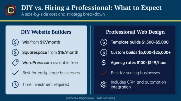
DIY works when you are early-stage, budget-constrained, or running a straightforward service offering. Platforms like Wix (plans starting at $17/month), Squarespace (from $16/month annually), and WordPress.com can produce a professional result if you invest in quality photography and write clear copy. The risk is time — and the opportunity cost of getting it wrong.
When Hiring a Professional Makes Sense
Hiring a professional makes sense when:
- Your current site is actively losing you business
- Your brand authority has outgrown a template
- You need the site to integrate with marketing automation, booking systems, or a CRM
- You are scaling and every unconverted lead has a real dollar cost
Clutch data shows professional web design agencies typically charge $100–$149 per hour. For project-based work, template-based professional builds generally run $1,500–$5,000; fully custom sites for service businesses typically range from $5,000 to $25,000 or more depending on scope and integrations.
What the Right Partner Actually Does
A strong professional partner does more than make your site look good. They structure it to attract qualified visitors, answer the questions buyers actually have, and connect to the systems that turn traffic into revenue.
Gross Consulting's website engagements are built around that outcome. Clients receive:
- CRO-optimized landing pages designed around buyer intent
- A/B testing and behavioral analytics via heatmaps
- Full brand identity packages
- Integration with marketing automation, booking systems, and CRMs
The result is a site that performs as a business asset, not just a digital brochure.
Frequently Asked Questions
How much does small business website design cost?
DIY platforms like Wix or Squarespace run free to roughly $50/month for hosted plans. Professionally designed template-based sites typically cost $1,500–$5,000, while fully custom builds range from $5,000 to $25,000 or more. Add ongoing costs for hosting, domain registration, and maintenance on top of the initial build.
What are the 7 C's of small business website design?
The 7 C's — Context, Content, Community, Customization, Communication, Connection, and Commerce — are a framework for evaluating how well a website serves visitors at every touchpoint. Each element addresses a different dimension of the user experience, from how content is organized to how the site drives action.
Do I need to hire a web designer, or can I build my own site?
Many small business owners successfully use Wix or Squarespace to build a functional, professional site on a limited budget. Hiring a professional becomes worthwhile when your site needs to integrate with marketing systems, drive serious lead generation, or present a level of credibility and polish that a template simply can't deliver.
How many pages does a small business website need?
At minimum: Homepage, About, Services, and Contact. From there, add testimonials, FAQs, and individual service pages as you grow — what's on each page matters more than how many pages you have.
How do I know if my website is actually working?
The clearest signal is whether it's generating inquiries or sales. Beyond that, metrics like organic traffic, bounce rate, and time on page in Google Analytics reveal whether visitors are engaging or leaving immediately after arriving.
What is the single most important element of a small business website?
Clarity. A visitor should know within seconds who you help, what you do, and what to do next. Even a visually polished site fails if the core message is confusing, buried, or written for the wrong audience.