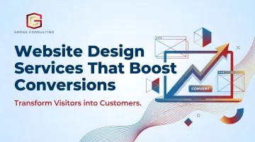
Users form aesthetic judgments of your website within 50 milliseconds. Before a visitor reads your credentials or reviews your service list, they've already decided whether you look credible. And when the design fails that test, visitors leave without converting, without telling you why, and without coming back.
The problem isn't traffic. Most service businesses already spend heavily driving visitors to their sites through paid ads, SEO, and referrals. The problem is what happens after the click. Websites built as digital brochures, listing services and credentials without guiding action, bleed revenue with every visit. This guide breaks down what conversion-focused website design actually means, the specific elements that drive action for service businesses, and how to stop leaving money on the table.
TLDR
- Users judge credibility in 50 milliseconds based primarily on visual design
- Professional services landing pages convert at 6.1% median, with massive room for optimization
- Mobile delivers 81% of traffic but converts 40% lower than desktop for service businesses
- 97% of consumers read reviews before contacting a business
- Strategic design bridges the gap between "interested visitor" and "booked consultation"
What "Conversion-Focused" Website Design Actually Means
A conversion-focused website is strategically built around user behavior and decision-making. Every layout choice, headline, button placement, and image exists to guide a visitor toward a specific action: scheduling a call, submitting a form, requesting a quote. This stands in sharp contrast to websites built primarily for aesthetics or brand presence, where design serves to impress rather than convert.
The psychological foundation matters because research shows that approximately 75% of credibility judgments are based on content presentation rather than content authority. Specifically, 46.1% of users cite "design and look" as their primary credibility marker, while another 28.5% cite "information design" (layout and structure). For service businesses selling intangible expertise, visual professionalism isn't optional - it's the prerequisite for every conversation that follows.
What Conversion Means for Service Businesses
Unlike e-commerce, conversion for a service business rarely means an immediate purchase. It's a micro-commitment - a consultation booked, a form filled, a call scheduled. The website's job is to bridge the gap between "interested" and "ready to talk" by:
Unlike e-commerce, conversion for a service business rarely means an immediate purchase. It's a micro-commitment - a consultation booked, a form filled, a call scheduled. The website bridges the gap between "interested" and "ready to talk" by:
- Reducing friction at every decision point
- Establishing trust before a prospect ever reaches out
- Making the next step obvious and low-effort
Treat your website as a system, not a brochure. It should align with your broader marketing and sales infrastructure, lead follow-up, CRM integration, nurture sequences, so it functions as part of a growth engine, not an isolated asset.
That's exactly how Gross Consulting approaches website design: as one connected piece of a larger system where design, automation, and strategy work together. The result is a site that doesn't just look professional - it actively turns clicks into clients by integrating with CRM platforms, automation tools like Zapier and GoHighLevel, and lead nurture sequences.
Why Most Service Business Websites Fail to Convert
The most common failure pattern is the digital brochure trap: websites that list services and credentials but give visitors no clear reason to act. Without a defined user journey, visitors browse and bounce.
Friction Points That Kill Conversions
The most damaging friction points include:
- Slow load times - As page load time increases from 1 second to 3 seconds, bounce probability jumps 32%, and from 1s to 5s, that number hits 90%. A Deloitte and Google study found that a 0.1-second improvement in mobile speed for lead generation brands increased form submission rates by 21.6%. Speed is a direct conversion lever.
- No clear value proposition above the fold - Visitors shouldn't have to scroll to understand what you do and who you serve.
- Invisible or weak CTAs - If the next step isn't obvious, visitors won't take it.
- Generic copy - Language that doesn't speak directly to the visitor's specific pain point fails to connect emotionally or logically.
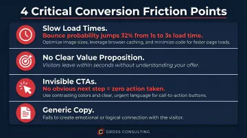
Each of these friction points compounds the others. A slow site with weak copy and a buried CTA doesn't just underperform - it actively erodes trust.
The Silent Abandonment Problem
Unlike a bad in-person meeting, a poor website experience generates zero feedback. Users leave without explanation. Without analytics, heatmaps, or professional guidance, business owners have no way to diagnose what's broken, and the pipeline stays quiet while the root cause goes unaddressed.
The Design Elements That Drive Conversions for Service Businesses
Clarity Above the Fold: Your Three-Second Value Proposition
The hero section of your homepage must immediately answer three questions:
- Who are you?
- What do you do?
- Who is it for?
Generic or clever headlines that prioritize wordplay over clarity are conversion killers. For service businesses, the value proposition should lead with the outcome the client gets, not the firm's credentials.
Strong example: "We help small law firms book 30% more consultations through conversion-optimized websites and Meta ads."
Weak example: "Full-service legal marketing solutions."
The strong version tells a prospect exactly what they'll gain - the weak version could mean anything.
Strategic CTAs: Telling Visitors Exactly What to Do Next
Passive websites don't generate leads - the CTA is the conversion command. Weak CTAs like "Click Here" or "Learn More" fail because they don't communicate value or urgency.
Value-driven CTAs like "Schedule Your Strategy Session" or "Get Your Free Site Audit" tell visitors exactly what happens next and why it matters.
CTA Placement Strategy:
- Above the fold on the homepage
- At the end of every service page
- Within blog content where relevant
- In the navigation bar for high-intent visitors
Each CTA should match the intent of the page it lives on. A visitor reading about tax planning shouldn't see a generic "Contact Us" - they should see "Schedule a Tax Strategy Call."
Navigation and UX: Remove Every Obstacle
Confused visitors don't convert - they leave. Navigation should use intuitive, standard labels like Services, About, and Contact, following a logical hierarchy. The path from landing to inquiry should require as few decisions as possible.
The principle of reducing cognitive load is critical. Research from Nielsen Norman Group shows that when information exceeds the brain's processing capacity, users take longer to understand content, miss important details, or abandon the task entirely. Fewer menu items, logical content grouping, and visible contact options reduce friction.
The concept of attention ratio quantifies this: a typical homepage has an attention ratio of 40:1 (40 competing links per 1 conversion goal). An optimal landing page has a 1:1 ratio. The more choices you present, the harder you make it to convert.
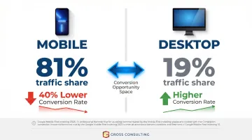
Mobile-First Design and Page Speed
Mobile devices accounted for 62.54% of global website traffic in Q2 2025. For service businesses specifically, the numbers are even more dramatic: professional services landing pages receive 81% of their traffic from mobile devices.
Despite that traffic volume, mobile converts 40% lower than desktop for professional services. That gap is the single largest conversion opportunity most service businesses are leaving on the table. A broken mobile experience doesn't just lose conversions - it disqualifies you before the first conversation.
Google completed its migration to mobile-first indexing on October 31, 2023. Google now uses the mobile version of your site's content for indexing and ranking by default, meaning poor mobile design hurts both user experience and search visibility at the same time.
Building Trust Through Design: The Professional Services Advantage
Service businesses sell intangible expertise. Clients cannot inspect a product before buying, so your website must do the trust-building work that a physical product would otherwise do. Design signals competence before a word is read.
Social Proof and Testimonials
BrightLocal's 2026 consumer review survey confirms that 97% of consumers read online reviews for local businesses, and 85% are more likely to use a business after reading positive reviews. But not all testimonials are equal.
Effective testimonials include:
- The client's name and company
- A specific outcome or result
- Context about the problem solved
Example: "Gross Consulting rebuilt our website and set up our Meta ads funnel. We went from 3 consultation requests per month to 12 in the first 60 days." - Sarah Mitchell, Anderson & Associates Law Firm
Generic praise like "Great service, very professional!" adds little credibility. When you want to go deeper, case studies structured around the Problem/Solution/Result format give prospective clients the full picture, and are the gold standard for B2B service firms.
Research from Northwestern's Spiegel Research Center found that for higher-priced items, displaying reviews increases conversion rates by 380% versus 190% for lower-priced items. Since professional services often involve engagements costing thousands of dollars, trust signals directly determine whether a prospect books a call or bounces.
Credentials and Trust Signals
For attorneys, accountants, and healthcare providers, industry-specific credentials carry significant weight. Accreditations, certifications, media mentions, and awards should be visible above the fold or near the primary CTA.
For firms like Gross Consulting, displaying Verified Meta Business Partner and Verified Gusto Accountancy Partner status at the top of the page immediately answers the prospect's first question: "Can I trust these people with my business?"
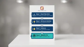
Service Pages That Pre-Sell
Each service page should be structured like a closing argument:
- Start with the client's pain point - Acknowledge the problem they're facing
- Present the service as the solution - Explain how your approach solves it
- Provide evidence - Case studies, testimonials, or data
- Close with a specific CTA - Not "Contact Us," but "Book a Litigation Consultation" or "Schedule a Tax Strategy Call"
Avoid generic CTAs. Specificity builds confidence and reduces hesitation.
Visual Design Consistency as a Trust Signal
Fonts, colors, imagery, and tone should all align with your firm's brand identity and the expectations of your target client. A financial firm's design should communicate stability and precision. A growth consulting firm should communicate momentum and clarity. When these elements clash, mismatched fonts, stock photos that don't reflect your client base, a tone that shifts mid-page, visitors notice. And in professional services, that friction is often enough to send them to a competitor.
Data-Driven Optimization: How to Know What's Working
Launching a website without tracking is like running a sales team with no CRM. You're flying blind.
Baseline Measurement: What to Track
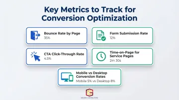
Set up analytics, conversion tracking, and goal funnels before or at launch. Key metrics include:
- Bounce rate by page
- Form submission rate
- CTA click-through rate
- Time-on-page for service pages
- Mobile vs. desktop conversion rates
Knowing where users drop off reveals where to focus optimization efforts. Behavior tools take that a step further.
User Behavior Tools: Heatmaps and Session Recordings
Heatmaps and session recordings show where users click, how far they scroll, and where they abandon, revealing friction points that raw analytics can't explain. For example, if heatmaps show users clicking non-clickable elements, you've found a navigation issue worth fixing before it keeps costing you leads.
A/B Testing: The Continuous Improvement Engine
A/B testing means showing two versions of a page element, headline, CTA text, form length, or button color, to different visitors and measuring which performs better. Even small, incremental improvements compound over time.
Unbounce data shows that professional services landing pages written at a 5th-7th grade reading level convert at 12.9% median, while those at an 8th-9th grade level drop to 6.6%, a 49% decline. If your service pages read like a legal brief, that's a test worth running first.
Common Website Design Mistakes That Kill Conversions for Service Businesses
Feature Overload and Visual Clutter
Too many elements on a single page, pop-ups, animations, multiple service listings, competing CTAs, pull visitors in too many directions at once. Every element should have one job: support the conversion goal.
Common clutter culprits to audit and remove:
- Autoplay animations that distract from the headline
- Multiple CTAs competing for the same click
- Navigation links that lead visitors away from the conversion path
- Pop-ups triggered before the visitor has read anything
No Clear Differentiation
Many service firm websites look and sound identical. Headlines like "We're passionate about helping our clients succeed" do nothing. Your website must answer: Why you, over every other firm? Find a clear differentiator and lead with it. Specificity builds credibility.
Neglecting the Post-Click Experience
Even a compelling differentiator falls flat if the post-click experience doesn't match. Driving paid traffic to a generic homepage wastes intent - a visitor who clicked an ad for "business consulting for law firms" should land on a page built for exactly that, not a homepage with 40 competing links.
Unbounce's analysis of 300 paid ads found that 98% failed to use focused landing pages with properly matched headlines, sending traffic instead to multi-purpose pages with competing calls to action. For service businesses paying $100+ per click on legal or B2B ads, that's a direct, avoidable money drain.
Frequently Asked Questions
What makes a website "conversion-focused" versus just visually appealing?
A visually appealing site prioritizes aesthetics, while a conversion-focused site is strategically structured around user behavior, clear CTAs, and a defined path to action. The goal is measurable business outcomes, leads, bookings, and sales, not just a site that looks good.
How long does it take to see results after a website redesign focused on conversions?
Initial improvements in engagement metrics like bounce rate and time-on-page can appear within weeks. Meaningful conversion improvements typically become measurable within 30-90 days, especially with A/B testing and ongoing optimization.
What is the difference between web design and conversion rate optimization (CRO)?
Web design establishes the structure, visuals, and functionality of the site. CRO is an ongoing process that uses data, testing, and user behavior analysis to increase the percentage of visitors who take a desired action, and it never really stops.
How important is mobile design for a professional service business website?
Mobile is critical. A large share of initial research happens on phones, and a poor mobile experience signals incompetence to high-value prospects before they've read a single word of your content. For most service businesses, mobile accounts for the majority of first-touch visits, which makes mobile optimization a baseline requirement, not an upgrade.
Should a service business prioritize SEO or conversion optimization for its website?
Both work together. SEO brings traffic; CRO ensures that traffic converts. A site optimized for conversions also tends to perform better in search rankings because good UX signals like low bounce rate and time-on-page are factors Google considers.
Why use professional web design services instead of a template or DIY builder?
Templates offer aesthetics without strategy. They aren't built around your specific audience, business goals, or conversion path. Professional web design ensures your site is built for measurable business outcomes, not just to look presentable.