Sound familiar? This is the gap between having a logo and having an actual brand identity — and it's one of the most common marketing problems attorneys, doctors, consultants, and other service professionals run into.
This guide breaks down exactly what brand identity is, what it includes, how to choose the right logo type, and how to build a cohesive system that builds trust — without needing a design background.
Key Takeaways
- A logo is one visual mark; brand identity is the entire system that shapes how your business is perceived
- Brand identity includes your logo, color palette, typography, imagery, tone of voice, and story
- Choosing the right logo type — from wordmarks to emblems — depends on your industry and positioning
- For service businesses, brand identity is a direct trust-building tool that influences buying decisions
- Follow a clear process and you can build a strong brand identity without starting from scratch
Logo vs. Brand Identity: What's the Difference?
These two terms get used interchangeably, but they describe very different things.
Here's how each term breaks down:
- Logo — a visual symbol or wordmark that identifies your business at a glance; the most immediately recognizable element, but only one piece of the picture
- Brand identity — the full collection of visual and symbolic elements that represent a brand: name, logo, color scheme, typography, and design elements working together to create a recognizable impression, as defined by the American Marketing Association
- Branding — the active process of applying that identity across every touchpoint; brand identity is the toolkit, branding is how you use it
Identity vs. Image
Brand identity is internally defined — it's what your business wants to project. Brand image is externally formed — what clients actually perceive.
The gap between the two is where trust erodes. Consistency closes it.
Apple is the classic example. The logo is a simple apple silhouette. But the brand identity — minimalist design, premium packaging, a specific tone in every ad — is what creates emotional connection. The logo gets you recognized. The identity earns the trust.
The Core Elements of a Strong Brand Identity
Logo
While it's just one element, your logo serves as the visual anchor for everything else. Shape matters more than most business owners realize — research summarized by the Association for Psychological Science found that circular and angular logo forms can meaningfully shift perceptions of a company's attributes: warmth, precision, stability, durability. Match your logo's form to what you want clients to feel.
Color Palette
A brand color palette is a defined set of 2–4 colors used consistently across all materials. Color influences perception fast — research published in the journal Management Decision found that initial judgments can occur within 90 seconds, with 62–90% of that assessment based on color alone.
What colors communicate:
- Blue — competence, trust, professionalism (well-supported for legal, financial, and medical services)
- Green — growth, wellness, natural
- Black/navy — authority, sophistication
- Warm tones — approachability, energy
Typography
Fonts set tone before a single word is read. Serif fonts (Times New Roman, Garamond) carry associations of tradition and authority — common in law and finance. Sans-serif options like Helvetica or Montserrat read as modern and direct. Whichever direction you go, legibility across business cards, websites, and proposals is non-negotiable.
Brand Voice and Messaging
Verbal identity is just as important as visual identity. The tone, language, and messaging style you use across all communications defines how clients experience your brand before they ever meet you. A friendly, conversational voice attracts different clients than a formal, authoritative one — and for service businesses where relationships drive decisions, this choice has real revenue implications.
Consider where your voice falls on the spectrum:
- Conversational — builds rapport quickly; suits coaches, consultants, and approachable service brands
- Authoritative — signals expertise and credibility; common in legal, financial, and medical practices
- Empowering — motivates and energizes; works well for growth-focused and entrepreneurial audiences
The right voice isn't about preference — it's about who you're trying to attract.
Brand Story and Tagline
A brand story communicates why your business exists — its founding purpose, values, and mission. A tagline distills that into one memorable phrase.
Gross Consulting's tagline — "Not All Heroes Wear Capes — Some Build Businesses" — is a useful example. In six words, it communicates the target audience (entrepreneurs), the brand's respect for them, and the firm's empowering, action-oriented personality. It doesn't just describe services; it captures identity.
The 7 Types of Logo Design (and When to Use Each)
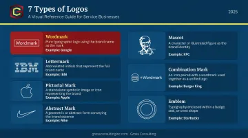
Design professionals recognize seven main logo types. Here's a quick breakdown:
| Logo Type | Description | Example |
|---|---|---|
| Wordmark | Text-only, full business name | |
| Lettermark | Initials only | IBM |
| Pictorial mark | Standalone icon or symbol | Apple |
| Abstract mark | Geometric shape representing the brand | Nike swoosh |
| Mascot | Illustrated character | KFC Colonel |
| Combination mark | Icon + text together | Burger King |
| Emblem | Text inside a symbol or badge | Starbucks |
Which Type Fits Your Business?
For service-based businesses — attorneys, consultants, financial firms, medical practices — the choice usually comes down to two options:
- Wordmarks work well when your firm name is distinctive and you need clients to remember it immediately. When there's no visual icon to rely on, the name carries all the recognition.
- Combination marks are the most versatile choice for growing firms. They pair name recognition with a symbol, giving you flexibility across business cards, websites, and social media.
- Mascots and abstract marks work better for consumer brands with established visual recognition. A new consulting firm doesn't yet have the brand equity for an abstract symbol to carry meaning on its own.
Common Mistakes to Avoid
- Choosing a logo style because it looks trendy, not because it fits your positioning
- Using complex designs that fall apart at small sizes (business cards, mobile screens, favicons)
- Skipping black-and-white testing: if the logo doesn't hold up in grayscale, it won't hold up everywhere
Before finalizing any logo, test it at three sizes: full-width on a website header, thumbnail on a social profile, and small on a business card.
Why Brand Identity Matters for Service-Based Businesses
Service businesses face a unique challenge: clients can't inspect what they're buying before they commit. An attorney can't show a prospective client a finished case. A consultant can't hand over a strategy until they're hired. So clients rely on visual and verbal signals to decide whether to trust you enough to engage.
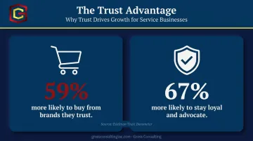
Brand identity is, in that sense, a business development tool. Edelman's research found that 59% of consumers are more likely to buy from brands they trust — and 67% are more likely to stay loyal and advocate for those brands. For service firms, trust isn't a nice-to-have. It's the conversion mechanism.
The Cost of Inconsistency
Here's what actually happens when brand identity is inconsistent:
- A polished website paired with an unprofessional email signature signals disorganization
- Mismatched social media graphics suggest the business is poorly managed
- A logo that looks different on every document makes clients wonder what else isn't buttoned up
In professional services especially, this erodes trust before a conversation even starts.
Brand Identity as a Scalable Asset
As your business grows, adding team members, launching new services, and entering new markets, a defined brand identity ensures consistent presentation regardless of who's creating materials. Without it, every new hire and every new channel introduces more inconsistency. In practice, that looks like:
- A new team member producing a proposal that doesn't match the website
- A vendor-created social graphic that uses the wrong logo version
- A pitch deck that feels disconnected from the brand clients already trust
This is the foundation Gross Consulting helps service businesses build. The firm's Branding, Website & CRO service starts from a clear premise: "Your brand is more than a logo. It's the foundation of how clients see and trust you." That brand system carries weight across every channel, every hire, and every stage of growth — not just at launch.
How to Build Your Brand Identity From Scratch
Step 1: Clarify Your Brand Foundation Before Touching Design
Design decisions should flow from strategic decisions, not the other way around. Before you open any design tool, define:
- Your mission: the reason your business exists
- Your core values: the principles that shape how you operate
- Your target audience: who specifically you're trying to reach
- Your unique value proposition: what you offer that competitors don't
Run a basic competitive analysis. Look at how similar businesses in your market present themselves, then identify the gaps — what's missing, what's overdone, and where you can carve out a distinct position.
Step 2: Build Your Visual and Verbal Identity Elements
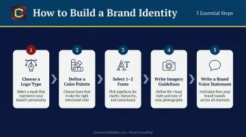
With your brand foundation in place, work through each element in order:
- Choose a logo type — wordmark or combination mark for most service businesses
- Define a color palette — 2–4 colors with specific hex codes
- Select 1–2 fonts — one for headings, one for body text
- Write imagery guidelines — what style of photography or illustration fits the brand
- Write a brand voice statement — two to three sentences describing how your brand sounds
Document everything in a brand style guide. It doesn't need to be elaborate — a single well-organized page covering logo usage, color codes, typography, and tone of voice is enough to start. Once it's documented, applying it consistently is what turns a collection of design choices into a recognizable brand.
Step 3: Apply Consistently and Audit Regularly
A brand identity only works if it shows up everywhere. Key touchpoints to address:
- Website (every page, not just the homepage)
- Email signatures
- Social media profiles and graphics
- Proposals and pitch decks
- Business cards and printed materials
- Invoices and client-facing documents
Schedule a brand audit every 6–12 months. Check for inconsistencies, update elements when the business evolves, and give new team members the style guide before they create anything client-facing.
Frequently Asked Questions
What is logo and brand identity?
A logo is a single visual symbol that identifies your business. Brand identity is the broader system — including logo, colors, typography, tone of voice, and messaging — that together shape how your business is perceived by clients and the public.
What is an example of brand identity and logo?
Apple's logo is a simple apple silhouette. Its brand identity, however, extends across product design, packaging, retail experience, and advertising — all aligned to premium simplicity. The logo identifies; the identity creates the emotional connection.
What are the 7 types of logo design?
The seven types are: wordmark, lettermark, pictorial mark, abstract mark, mascot, combination mark, and emblem. The right choice depends on your business name's recognizability, your industry, and how the logo will be used across different formats and sizes.
What are the 5 P's of brand identity?
The 5 P's are a practical brand framework: Purpose (why you exist), Positioning (how you differentiate), Personality (your brand's human traits), Perception (how clients actually see you), and Promotion (how you communicate across channels).
What is the difference between brand identity and branding?
Brand identity is the collection of design and messaging elements your business creates — the logo, colors, voice, and story. Branding is the active process of applying those elements consistently across every client touchpoint to shape how people perceive you over time.